Saturday 25 February 2017

Pic


This image is taken in an Mrt station.
Colour: Bright and eye-catching colours in hues of yellow, green, blue and white.

Reminds me of the colours seen in modern comics.

Layout: Rectangular strips of same sizes. Small circles in a chaotic display takes up the spaces in the rectangular.

Reminds me of modern comic book's display. Layout are normally in geometric shapes yet the graphic illustrations are rather chaotic and messy with colours, lines and such.

Tuesday 21 February 2017

Comic Design Layout

Library and web research


CLASSIC
-Comic strips


Image 1
Mr. Pewee Sept 16, 1903


Image 2


MODERN
-Comic Book

Image 3
UNDERWORLD UNLEASHED 
(scanned from library bk)


Image 4
UNDERWORLD UNLEASHED 
(scanned from library book)


Image 5
UNDERWORLD UNLEASHED 
(scanned from library book)


Comics always have a similar layout. From what I have researched, the template is always seen to be in geometric shapes.

Looking at Image 1 and 2 , which are classic comic strips from newspapers, both are neat and simple in square and rectangular boxes, all placed in an orderly manner. It was the standard design layout used in the early days, printed on newspapers.

Comparing it to Image 3,4 and 5, which are from a comic book, the layout features geometric designs. Image 3 is shown in rectangular strips, giving an orderly template. Image 4 features different sizes of rectangles, through a mix of horizontal and vertical layout, still producing a quite consistent order of template layout. Image 5 portrays chaos through irregular rectangles of different sizes.

Through this research, I think that the comic themed trend should feature geometric patterns and cuts of varying shapes and sizes, portraying the design layout seen in comic strips and books.


Monday 20 February 2017

Classic Comics strips (Library Research)

Through library and web research, I have found few old comic strips that were very popular back in the 20th century til now. These comics serves as the classic caricature.


KRAZY KAT


Krazy Kat was first produced in the year of 1913, an American newspaper comic strips by George Herirman. Krazy Kat was created with simple slapstick humour, poetic language along with an innocent playfulness, making it a favourite of the people back then. 


THIMBLE THEATRE - POPEYE


Thimble Theatre first appeared in the New York Journal and the Daily King Features comic strips in 1919, created by Elzie Crisler Segar. The strips were often portrayed in a theatrical style, hence the name. Originally, it centers around the Oyl family. When Popeye was introduced in 1929, he bacame so popular that he was given a larger role, and sooner than later, the comic started to revolve around his adventures.


CALVIN & HOBBES


Calvin & Hobbes, created by American cartoonist, Bill Waterson, was first printed on newpaper in 1985. It was so famous that it was featured in over 2,400 newspapers worldwide. The comic strips centers on friendship and even explores issues on public education, environmentalism and such.


Looking through these classic comics, I find certain visual elements that stays consistent.
For example, the simple caricature and portrayal of settings and characters. The colours are mostly flat unlike comics of today. Moreover, the classic black and white gives the simplicity, focusing more on the plot and dialogue. However, Krazy Kat comic strips has a more eye-catching visual with the lines for shading and such.


BOOKS
Comics: A Global History, 1968 to the Present, Alexander Danner and Dan Mazur
Comic Book Century,Stephen Krensky

https://en.wikipedia.org/wiki/Popeye
https://en.wikipedia.org/wiki/Krazy_Kat
http://tdc-images.s3.amazonaws.com/calvin-hobbes-auction-large.jpg

Comic FONTS


BATMAN '66 VOL. 1
(Scanned library book)
ARCHIE #44 (1943)

Looking through comic books, there is a strong similarity among all of them, being the eye-catching titles. Titles are always in bold wordings and striking colours. This characteristic has gone down through history, as could be seen in Archie #44 which is written in the 40s, big fonts complimented with a striking red. Then in the modern 21st century, as seen, Captain America, Thor, Iron Man and such, bears the resemblance of striking titles.


DETECTIVE COMICS #5 (July 1937)
(Scanned library book)

Other than titles, the contents of a comic book always feature fonts that gives the wanted 'sound' effect, as seen above. These fonts are always portrayed in contrasting and strong colours such as red, yellow and blue.


Saturday 18 February 2017

Perspectives and Stereotypes

Lesson 2

Given an exercise that involves two pictures, we were told as a group to jot down characteristics that we could find.

As a group, we tried looking at it in different perspective, trying to think out of the box based on what we were given. Apparently, both images were linked in terms of trend, being simple low key living.
Using the Diffusion of Innovation curve, made it easier to understand how the flow of ideas and trend goes down the line of people.

This gives me a wider understanding to how trend works, thus making it simpler for me to relate it to my theme. Moreover, the exercise shows how my theme can be extended and broaden through ideas and links.

We were then presented with two videos that involves stereotyping.
I think the 2nd video was the most relevant as they tried pulling people around them, away from the usual stereotype of thinking that chinese goods are always low quality by selling goods and items that are of the works of Asian designers, in Chinatown. I think it was a good experiment. Diminishing the existent stereotypes is hard to achieve, though I believe it could be slowly reduced.

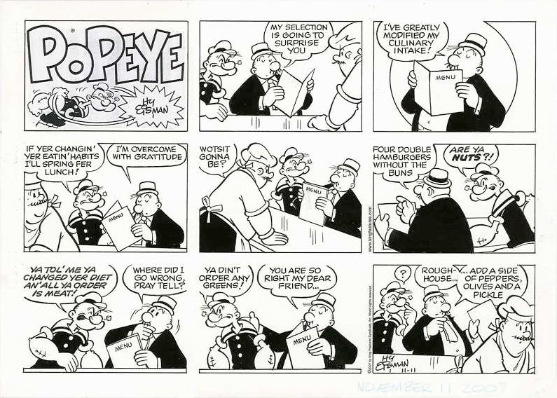
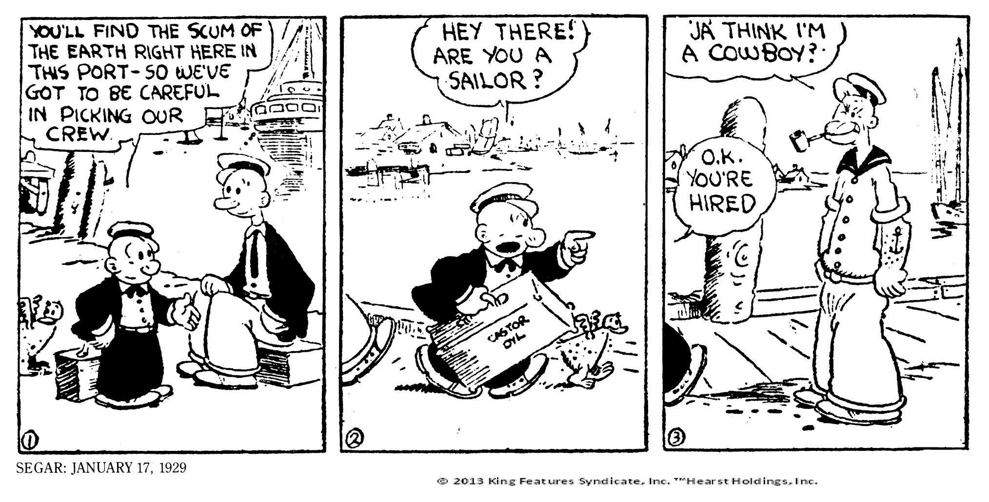
Relating to my topic of comics, there has been a huge stereotype label placed on people who reads comic books. Often, they are very much referred to 'geeks' or 'nerds'. I believe that these stereotypes have to go.

Though this stereotype label has been lessening ever since the introduction of movies based on comics, for example, The Avengers or Suicide Squad. It has been a huge hit with teenagers and adults. To add on, many have started dressing up as these comic characters. And it was reported that the DC comic character of Harley Quinn from the Suicide Squad movie has made it to the highest poll of being the muse of Halloween's dress up in 2016.
With that, I think that views on comics has evolved and gained popularity through the years, making it especially a strong source of influence in fashion.

Wednesday 15 February 2017

Graffiti pop art

The Joker (DC Comics villain)

A graffiti art which is of a comic villain from DC Comics. Its interesting and fascinating how the villain's quote is used to create the details of his face.
The bright colours, striking fonts and the subject links to the comic theme.


The emphasis is of a vintage pop art, found mostly in comic books. The dots and lines creates an interesting art, along with the bright colours.


Popeye (Thimble Theatre comics) graffiti art


Wall filled with graffiti art. Main focus is of the comic character, Popeye. The huge fonts, shapes (stars, dots) and colours link heavily to the theme of comics. 

Monday 13 February 2017

Pics- Graffiti

These images are graffiti on a wall, being a part of Nafa. 

I took these images as I find them to be a strong link to my theme of Comics. 

Modern Comics are mostly portrayed in graphic prints and illustrations. With the huge and eye catching fonts seen throughout the wall, it definitely has the same elements as that of a comic book.

Moreover, the colours are a blend of bright and dark tones which are the usual colour palettes seen throughout comic books of these days, for example in a superhero comics whereby a portrayal of darkness and light are presented to readers.

The mixture of a chaotic and orderly assemblage of graffiti can clearly be seen, being another clear similarities to that of comic books.

All in all, I think these images are a great link to my theme, especially in terms of design elements.

Graphics
Loud 
Fonts
Lines

Fonts and words
Bright colours


Sunday 12 February 2017

Comics

Comics has been a huge success in the western pop culture through a century.

 It was even more popularized through the introduction of 2 huge comic companies, known as Marvel and DC comics which has published their own comic books through generations. Now, they bring about movies and TV series which has become the talk of the media. 


In 2016, a total of 6-8 movies was made by DC and Marvel, thus proving how popular they are. In 2017, a total of 7 or more movies by Marvel and DC would be brought to theaters. And Comic con 2017 would begin in July. 

Suicide Squad (2016)

Character dress up for Comic Con


With the huge influence that comics has on culture, I am sure it would be widely accepted into the fashion industry.


Saturday 11 February 2017

Diffusion of Innovation- Case Study

One such example that goes through the Diffusion of Innovation Curve is the classic little black dress.

Innovator
Innovated in the 20s by Coco Channel, the dress proved to be simple yet elegant. Thus being worn for parties and such.

Early Adopters
It was later popularized by Audrey Hepburn, especially in the film, Breakfast at Tiffany's.


Early Majority
 Through the years, it has been adapted and especially worn by many celebrities as formal wear. For example, Lady Diana, Natalie Portman and so on. 
As seen, Natalie Portman dons the exact dress that Audrey Hepburn wore in her film. With this feature being the front cover of Harper Bazaar's 2006 issue, it clearly shows that the LBD is still popular, and serves as a fashion statement.
Below is Lady Diana in the 1990s, wearing an elegant LBD as a formal wear. Her outfit has given an impact on the fashion industry and everyone wants to be as elegant as Lady Diana.


Late Majority
With that, designers came to bring this LBD into their collections, adding their signature style to it.
For example, Victoria Beckham's Fall 2015 Ready to Wear, which has a few collection of black dresses, made for work wear. She added her own signature style and soon enough an LBD becomes a signature garment of her label.


Laggards
 From then on, the little black dress could be worn anytime and anywhere. The Fast fashion market  such as Zara and H&M invests on selling this Lbd and now its seen in streetwear. We wear it on a daily basis to school, work and functions. It has gone through changes but the idea remains as a fashion staple.


Through this example, I can see who the Innovators, Early Adopters, Early Majority and Laggards are. It just proves that Everett Rogers' theory was right- being that all ideas go through the same process through the years. 


Friday 10 February 2017

Diffusion of Innovation

Lesson 1 & 2


The 1st week of lesson was an overview of forecasting fashion- what it is, how it works and so on. Through the presentation slides, I can thoroughly understand how important trend forecasting is in the fashion industry and business.

As an introduction to understanding the system of trend forecasting, we were told to read up on the Diffusion of the Innovation from the Trend Forecaster's Handbook by Raymond Martin. From there, we, as a group were to present our understanding and findings of this theory and how it effects the community and the fashion industry.

Apparently, the Diffusion of the Innovation Curve is a theory by Everett Rogers who first published his theory through books in the year of 1962. This theory was developed and studied through the results and findings of various projects done by him and his fellow sociologists.


“....Rogers was able to determine that, regardless of the innovation,
the pattern of diffusion through a particular group, community or
social tribe was the same.”
The Trend Forecaster’s Handbook

Raymond. M

Then, there is the Diffusion of Innovation Curve which i find it to be so helpful in understanding this theory.


It simply lets us understand the different people in the society and how an idea is transferred and adapted. It also allows me to see that I, as a designer should be an innovator, originating an idea, a trend.